Tuesday 7 February 2012

Rebel without a cause and 1950s research


Original 1955 Poster for the film Rebel  Without  A Cause
Final Poster based on 1950's Rebel Without A Cause

Initial sketchpad idea to get ideas for layout and colours
Rebel without a Cause and 1950's research 

 The 1950's had seen the end of World War 2 and the Cold war was still ongoing between the USA and the Soviet Union Communism vs capitalism. The Korean War had taken place between 1950 -1953.
Hans Otto Wendt Typography
The  1959 -up until 1975. The Cuban revolution 1953 -59 and Civil rights movements 1955 -1968 was going on.

This was also the decade where middle class teenagers started to rebel in  particular in the USA. Rock n roll The music of the youth which was a reaction against their parents.
The Likes of Elvis Presley Gene Vincent Chuck Berry and a whole host of other  artists were prominent.

The Golden era of 3- D Cinnematography happened during the the 50's and Pop Art began to come to the fore later made popular in the 1960's by Andy Warhol.

 Sputnik 1 the first Satellite to orbit the earth was launched by  Russia.Things were beginning to change quite rapidly and this set the tone for future.
The Film rebel without a cause a film encapsulating  teenage rebellion and violence emerged on the big screen the lead role being starred James Dean who played the teenage rebel Jim Stark. The Film was released just prior to his premature death  on September 30th 1955 in a car crash  aged just 24. This film capture  the classic anti establishment and in particular with middle classes rebelling a as more money became prominent after the war years.The Rebel without a cause set the tone for generations to come in respect of  teenage rebellion and influencing future films and dramas based around that very theme.The film was released by warner Brothers on October 27th  1955 less than one month after James Dean Had passed away.
The original film poster for rebel without a cause Typography was designed by Germany's Hans Otto Wendt[1911-1979] He desigmned many posters for Hollywood and 20th Century Fox including Casablanca.He designed  Unique Typography for each individual title of  a film.

Poster Research

I researched websites on 1950's Film Posters for  my design, and had previously seen the film on a couple of occasions . I looked through some books inluding my own Encyclopeadia of the 20th Century, as well as some  old design books  and read up on colours and typography used  in the 1950's film Posters.They seemed to use  only a couple of very bright Colours in the poster designs ie Yellows Reds, Blues and the neutrals Black & White.Large stand out text for the headling title and of the main Star in of the films in general.. I have included some 1950 film poster original designs below for reference. My original design is above the page with the original Rebel Without A Cause film poster is included just to reference research.I have  also included the basic  sketchpad idea Poster  i put together initially, just to get  a general layout and colour concept for my final Poster.


Thursday 26 January 2012

Title sequences

1950's title sequence:{1959 - 1966}          Rawhide.  
A typical western style Title sequence. Slow  intoduction and repetitious type text.Almost a cartoon style .Black and white .


1960's title sequence.{1959 - 1964}
Twilight Zone. Black and white type very clear , good quality and  standing ou,t with the sparse background. Very futuristic looking and possibly Art Deco style text?. 


1970's title sequence  Starsky & Hutch.{1975-1979}
Very colourful bold text fast moving title of good quality and very dramatic.Very typical of the era.Bombastic and very clear type.


1980's title sequence. {1983-1987}The A Team.

 Very iconic Music, very good quality graphic. Stencil style type font.Fast moving titles .A team title interesting movement.White text. 


1990's title Sequence  {1989-1993} Quantum Leap.

Fast pace intro, with fast moving titles Decade s running between clips ie 1964,1974 etc.
Iconic music.Back to the future style theme.Science fiction style 1930s Art deco  influenced.Swissed cheese style bold font.

00's title sequence {2004 -2012}

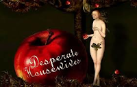
Desperate Housewives.

Artistic style very fancy text ,linotype .Very good quality graphics, with iconic Music .Artwork in  Pop Art style towards the end of the title sequence. References to Andy Warhol ,ie the can of soup.Very arty title sequence.


Wednesday 25 January 2012

Contemporary designers


Chip Kidd
Born : Charles Kidd : September 12, 1964 (1964-09-12) Pennsylvania


Chip Kidd is a famous iconic book cover designer. Famed for the Jurrasic Park book cover amongst others.He has also written a few novels. His first being the Cheese Monkeys {2001}followed by another book the learners.In 2011.
He started work on the Batman novel: Death by design which is a graphic novel.Chip Kidd also collaborated with the writers of the animated series Batman the brave and the Bold" the episode
Bat-Mite Presents, Batman's Strangest cases.

Chip Kidd is an avid collector of Batman memorabilia hence his involvement with Batman illustrations/animations.

Vaughan Oliver (born 1957)
English born designer Vaughan Oliver who did a lot of work for the 4AD record label in the 80's and 90's ..Working on album cover designs for bands such as the Pixies on their Doolittle album and singles such as Here comes your man.Working for studio 23 envelope.He worked under the studio name of v23.Oliver set the tone for the graphic revolution in the 1980's. He is sited as a real influence in the music industry as a post punk designer in experimentining in type and print in the industry.

Peter Saville (born 9 October 1955}
Peter saville is an English Graphic designer born in Manchester and also a Director. He did a lot of work for Factory records famous for bands like New order, Joy Division and the Cure amongst others.He studied at manchester Polytechnic between 1975 - 1978.
He met up with the late Tony Wilson who was a Journalist and television Presenter who was head of factory records. Peter saville became a partner in factory records.He designed Joy Division's controversial album Closer.He later became director of Virgin records off shoot label Din Disc working for Bands such as Ultravox, Roxy Music , Duran Duran wham and Omd Martha and the Muffins, Suede, Peter Gabriel and Pulp.
He founded Peter saville Associates company mainly dealing with designs for Music Artists and record labels.He then closed that in the 1990's to join Pentagram. Eventually he got into designing for Selfridges,EMi, Pringle,Cristian Dior and Stellar Mcartney amongst many others.He also designed the 2010 England football shirt. He was also a featured character in the Film 24 Hour Party people based on the Tony Wilson factory record story.
Jonathan Barnbrook
Jonathan Banbrook was born in Luton England in 1966.A Graphic designer and a Tycographer He was trained at the St. Martin's college and the Royal college of Art.
He is most famed for his work on the David Bowie album cover Heathen.He also designed fonts is very well known for his work in Japan..
His work is well known through his exhibition Friendly fire at the dsign museum in London.

Oliver Jeffers
Born in Belfast in 1977.
He is an illustrator and designer and graduated from the University of Ulster in 2001. His designs have been used in picture books and Childrens books., notably Harper Collins UK and Penguin books. He has had exhibitions in Dublin,New York , London, Syndney, Washington DC. and Belfast . He has won various awards and in 2008 featured in the times best picture book illustrators.
Ridley Scott {Born November 30th 1937 Yorkshire England.}
In space no one can hear you scream!!
Ridley Scott famed for directing films such as Alien, Blade Runner,Gladiator and Crusaders, among other well known films originally came from a Graphic design background. He spent 7 years at Hartlepools Mecca college eventually going into advertising/Photography /Graphic design/typography.He met Art Kane in New York and after working making Hamurgers and Tea and eventually got his break getting into printing and photography.He soon branched out into designing for plays,dramas and got further into design work.He eventually chose betwen becoming a full time Designer or full time Directing and decided directing paid more. He met a number of contacts through agencies and got into doing commercials and eventually film.The film he directed called Duellist cost $900,000 dollars which today would amount to around an astounding $85 million dollars.
His new Film a further extension on his Alien films Prometheus is out in June 2012.