Thursday, 26 January 2012

Title sequences

1950's title sequence:{1959 - 1966}          Rawhide.  
A typical western style Title sequence. Slow  intoduction and repetitious type text.Almost a cartoon style .Black and white .


1960's title sequence.{1959 - 1964}
Twilight Zone. Black and white type very clear , good quality and  standing ou,t with the sparse background. Very futuristic looking and possibly Art Deco style text?. 


1970's title sequence  Starsky & Hutch.{1975-1979}
Very colourful bold text fast moving title of good quality and very dramatic.Very typical of the era.Bombastic and very clear type.


1980's title sequence. {1983-1987}The A Team.

 Very iconic Music, very good quality graphic. Stencil style type font.Fast moving titles .A team title interesting movement.White text. 


1990's title Sequence  {1989-1993} Quantum Leap.

Fast pace intro, with fast moving titles Decade s running between clips ie 1964,1974 etc.
Iconic music.Back to the future style theme.Science fiction style 1930s Art deco  influenced.Swissed cheese style bold font.

00's title sequence {2004 -2012}

Desperate Housewives.
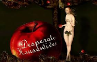
Artistic style very fancy text ,linotype .Very good quality graphics, with iconic Music .Artwork in  Pop Art style towards the end of the title sequence. References to Andy Warhol ,ie the can of soup.Very arty title sequence.


Wednesday, 25 January 2012

Contemporary designers


Chip Kidd
Born : Charles Kidd : September 12, 1964 (1964-09-12) Pennsylvania


Chip Kidd is a famous iconic book cover designer. Famed for the Jurrasic Park book cover amongst others.He has also written a few novels. His first being the Cheese Monkeys {2001}followed by another book the learners.In 2011.
He started work on the Batman novel: Death by design which is a graphic novel.Chip Kidd also collaborated with the writers of the animated series Batman the brave and the Bold" the episode
Bat-Mite Presents, Batman's Strangest cases.

Chip Kidd is an avid collector of Batman memorabilia hence his involvement with Batman illustrations/animations.

Vaughan Oliver (born 1957)
English born designer Vaughan Oliver who did a lot of work for the 4AD record label in the 80's and 90's ..Working on album cover designs for bands such as the Pixies on their Doolittle album and singles such as Here comes your man.Working for studio 23 envelope.He worked under the studio name of v23.Oliver set the tone for the graphic revolution in the 1980's. He is sited as a real influence in the music industry as a post punk designer in experimentining in type and print in the industry.

Peter Saville (born 9 October 1955}
Peter saville is an English Graphic designer born in Manchester and also a Director. He did a lot of work for Factory records famous for bands like New order, Joy Division and the Cure amongst others.He studied at manchester Polytechnic between 1975 - 1978.
He met up with the late Tony Wilson who was a Journalist and television Presenter who was head of factory records. Peter saville became a partner in factory records.He designed Joy Division's controversial album Closer.He later became director of Virgin records off shoot label Din Disc working for Bands such as Ultravox, Roxy Music , Duran Duran wham and Omd Martha and the Muffins, Suede, Peter Gabriel and Pulp.
He founded Peter saville Associates company mainly dealing with designs for Music Artists and record labels.He then closed that in the 1990's to join Pentagram. Eventually he got into designing for Selfridges,EMi, Pringle,Cristian Dior and Stellar Mcartney amongst many others.He also designed the 2010 England football shirt. He was also a featured character in the Film 24 Hour Party people based on the Tony Wilson factory record story.
Jonathan Barnbrook
Jonathan Banbrook was born in Luton England in 1966.A Graphic designer and a Tycographer He was trained at the St. Martin's college and the Royal college of Art.
He is most famed for his work on the David Bowie album cover Heathen.He also designed fonts is very well known for his work in Japan..
His work is well known through his exhibition Friendly fire at the dsign museum in London.

Oliver Jeffers
Born in Belfast in 1977.
He is an illustrator and designer and graduated from the University of Ulster in 2001. His designs have been used in picture books and Childrens books., notably Harper Collins UK and Penguin books. He has had exhibitions in Dublin,New York , London, Syndney, Washington DC. and Belfast . He has won various awards and in 2008 featured in the times best picture book illustrators.
Ridley Scott {Born November 30th 1937 Yorkshire England.}
In space no one can hear you scream!!
Ridley Scott famed for directing films such as Alien, Blade Runner,Gladiator and Crusaders, among other well known films originally came from a Graphic design background. He spent 7 years at Hartlepools Mecca college eventually going into advertising/Photography /Graphic design/typography.He met Art Kane in New York and after working making Hamurgers and Tea and eventually got his break getting into printing and photography.He soon branched out into designing for plays,dramas and got further into design work.He eventually chose betwen becoming a full time Designer or full time Directing and decided directing paid more. He met a number of contacts through agencies and got into doing commercials and eventually film.The film he directed called Duellist cost $900,000 dollars which today would amount to around an astounding $85 million dollars.
His new Film a further extension on his Alien films Prometheus is out in June 2012.

Monday, 16 January 2012

LS Lowry

LS Lowry self portrait


Laurence Stephen Lowry (Nov 1st 1887 -23rd Feb 1976 )Salford Manchester .

Lowry's painting s depict working class characters ,industrial buildings. They seem to depict disappointment and a wearied resignation.
Desolation defilement of the landscape is depicted at the end of the industrial revoultion period. Dystopia and visions of land waste smokey atmospheres and very dark imagery are captured in his paintings.

The scenes appear non political and the industrial Manchester is capture with it's canals warehouses and derelict buildings have an almost dickension{Oliver Twist} aura about them.

He used a scratch nail technique and his work typified working class life in the 1930s. Loneliness and down and out characters also seem prominent in some of his paintings.A lot of his paintings seem to use a white background , Reds Blues, Yellows {Ocre}Black and greys ,giving the pictures the feeling of a cold stark enviroment and harsh living conditions in Manchester at the time.


The Pond

The History of Pop Art


Pop Art History
Pop art was an Art movement established in Britain in the early 1950's and in the USA in the late 1950's.This was a style in contrast to fine Art in that it used things from  news, advertising,product labels.comic books, images and paintings of popular people of the day ,along with mass consumerism.
 The paintings  were sharp and had clear lines and bright colours.
Lawrence Alloway a leading Art critic defended pop Art as a legitimate form of Art and opposed elite Art culture.

Andy Warhol{Andrew Warhola}
                 (August 6, 1928 – February 22, 1987) Born in Pittsburg Pennsylvania. Died : New York City

Andy Warhol was an American painter,illustrator, print maker,Author, film maker and record producer with  the 60s band the  the Velvet underground and Nico.He was a leading figure in the pop Art movement. His famous expression was 15 minutes of fame.Believing everbody within their lifeime would be famous for  at least 15 minutes. He had an obsession for Coca Cola and was famous for his painting of Campbells soup and Cola bottles. He emphasised that the rich and the famous drank the same product eg Coca Cola as the poorest in society .
He painted famous people such as Marilyn Monroe, Elizabeth  Taylor amongst others. He opened the Factory and had workers reproducing his work for him. He mixed in celebrity circles and loved the whole Hollywood glamour culture. After his death a memorial service was held in Manhattan on April 1, 1987, at St. Patrick's Cathederal New York.
His influence in Pop Art still lives on today. 


Romero Britto


Romero Britto FIfa World Cup 2010 Design


Romero Brtto is a modern day Pop Art Artist , born in Brazil in 1963. His style has all the hallmarks of early pop art. He has worked with well known brands designing for the likes of Audi, Bentley, FIFA for whom he designed  the poster for the 2010 World Cup. He has also  worked with  Disney and Evian to name but a few He also does a lot of work for Charity organisations.

Romero Britto Pop Art

Romero Britto Design
Andy Warhol/Pop Art images
Add caption